Showing posts with label perspective drawing. Show all posts

Kitchen Color Scheme

Related Posts
1 Kitchen Design
2 Kitchen Zones
3 Perspective Drawing
4 Kitchen Color Scheme
5 Kitchen Drawer System
6 Hettich Drawer Slides & Runners

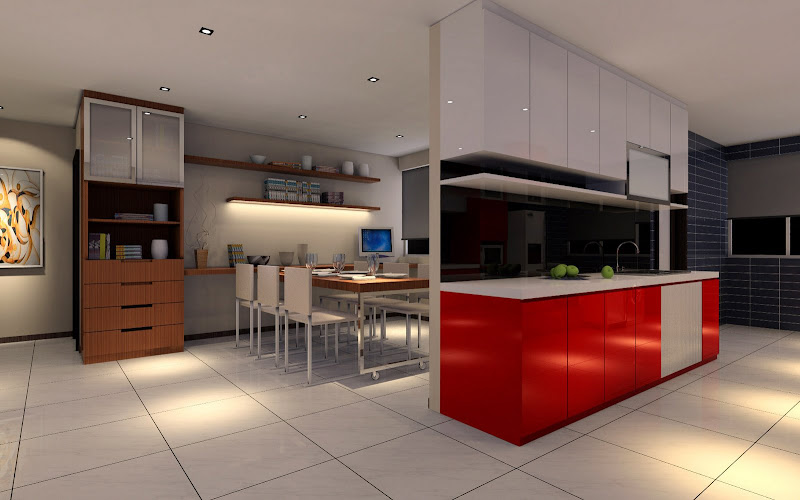
My ID submitted new perspective drawings of my kitchen with the color scheme I had indicated.

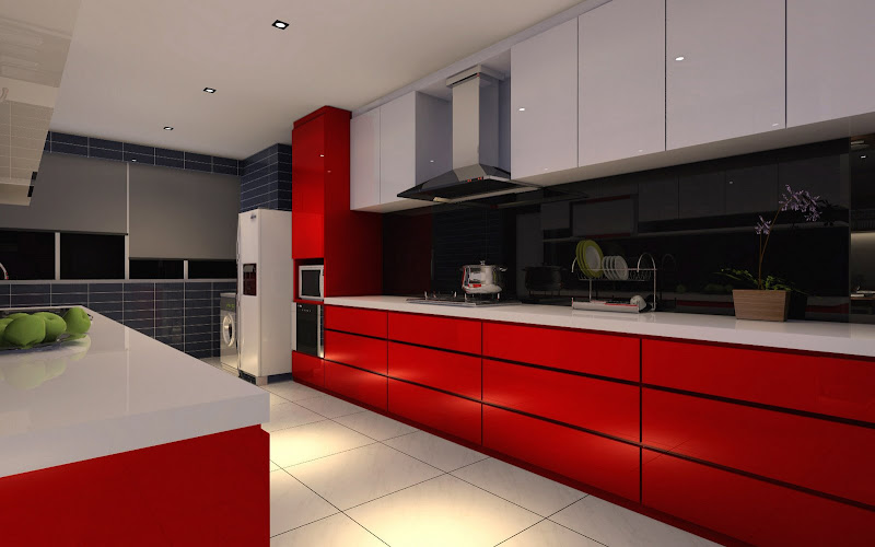
I must really give credit to my ID for his color sense. Originally I had wanted glossy red for the kitchen cabinets i.e. red for the cabinet fronts, and white for the counter top and cabinet carcass and sides. Not any kind of red, but a new red shade that was recently introduced, something like the red tone that appeared in Ikea's 2008 Kitchen Catalog.

But after mulling over the color scheme for several weeks, I felt it was too brash, too bold, too splashy! Too much red I thought. Maybe it would look good initially, but would we be able to live with it one or two years later?

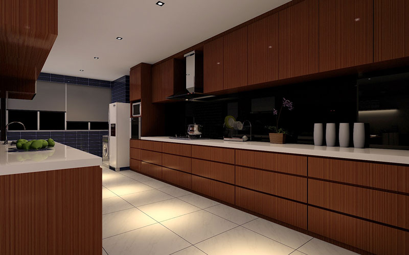
I began to feel it would perhaps be safer to err on the side of caution ... better select a neutral color like wood-grained paneling instead of bright, brashy red!

However, my ID liked my original choice of color and suggested the top cabinet could be in white, with the bottom cabinets in red. And he will use a glass backsplash that is spray-painted black. That will tone down the overall red impact, and give an overall classy look.

I wasn't convinced, and asked him to show me the drawings:

So what do you think?

hmm... I think I like the new color scheme, the red being toned down somewhat with white for the top cabinets instead of red. And the black glass back-splash complements the overall look. Nice !

But there would be some changes to the cabinet design.

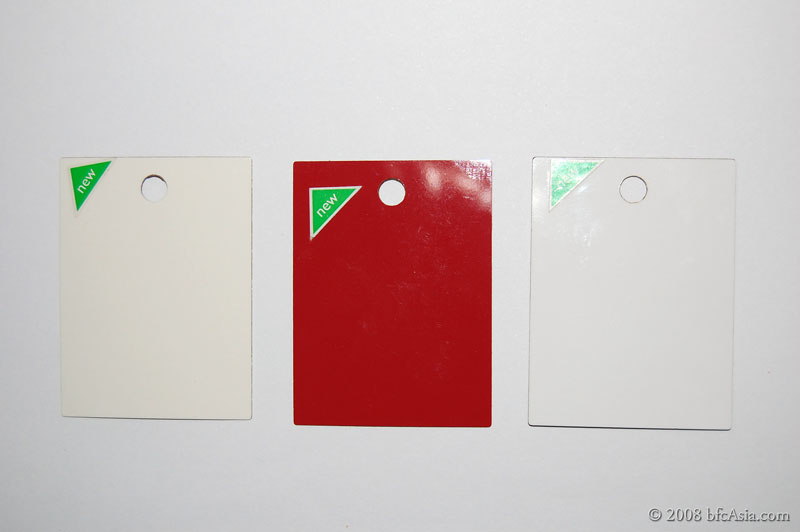
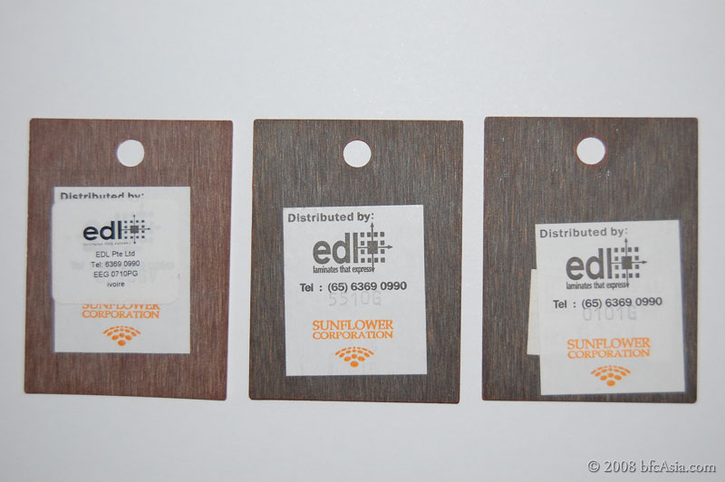
ADDENDUM: Some readers reacted strongly to the proposed color scheme, preferring a more neutral color. It is difficult to discuss colors based on what's shown on the web because somehow (blame it on my poor photographic skills) the color reproduced by the camera and the web is nowhere near the real thing.

For what it is worth, I reproduced below retouched pictures of the color samples, to be as close as possible to the colors chosen. The color codes are also given for those who have asked, EDL Laminate Color Code Ref: 5510G and 0101G in my case.


Related Posts
1 Kitchen Design
2 Kitchen Zones
3 Perspective Drawing
4 Kitchen Color Scheme
5 Kitchen Drawer System
6 Hettich Drawer Slides & Runners

Kitchen: Perspective Drawings

Related Posts
1 Kitchen Design
2 Kitchen Zones
3 Perspective Drawing
4 Kitchen Color Scheme
5 Kitchen Drawer System
6 Hettich Drawer Slides & Runners

As mentioned in other posts, I had sold our private apartment and was required to hand vacant possession to the buyer by 10-Feb 08. I only collected keys to the HDB resale flat on 14-Jan-08. I thus had very little time to renovate the HDB flat, because LNY fell on 7-Feb in 2008.

I therefore decided to renovate the flat in 2 stages: Stage 1 involved the wet works, replacement of doors and windows, plumbing, laying laminated flooring over the ceramic floors in the bedrooms, electrical rewiring, and air-con installation. Stage 2 would be the carpentry works.

Stage 1 has been essentially completed, remaining as at today (17-Mar-08) only the window areas to be tiled, following which the WC bowl could be installed. By the end of the week Stage 1 is expected to be completed.

The ID sent me the following perspective drawings for Stage 2 works, based on my requirements:

1-Proposed Galley Kitchen:

2-Proposed Dining Lounge and Galley Kitchen:

3-Proposed Wardrobe:

ADDENDUM: 27-Mar-2011
Now, don't be mesmerized by the drawings! Designers always exaggerate - just like property developers launching new projects - making larger-than-life perspective drawings to draw in the viewer. In reality my kitchen wasn't so humongous like Sketch #1. It would be wonderful if it was.

I have my own sketches, and chose my colors: red and white. That would be the color theme for the bath, toilet as well. It's important you choose a 'safe' color scheme that unifies all the spaces if you want a consistent look. Otherwise you risk getting a look that tires you out before long. Don't go for jazzy designs or designs that are too bold and attractive. Such designs may captivate you for a while, but it certainly will not last. Hence for a durable, eternal look I went for a safe white theme for my kitchen, bathroom, and toilet. Complemented by splashes of red. The red color was chosen carefully. Not all red shades are the same. I went for a shade that had tinges of orange for a darker tonal value than the opposite brighter one. To tone down and ensure that red did not dominate, I complemented the red cabinets with white. So the backdrop was white tiles, white cabinets, white work-top, with red sparingly used to add a bright sparkle to the kitchen. Result is a color scheme that is cheerful, yet not too jazzy, a look that I believe will stand the test of time. In other words, we're unlikely to get tired with the kitchen color theme for a long while.

And that's also why I opted for laminates this time: color and maintenance - those were the two cogent reasons. In my previous custom-fitted kitchen, I went for solid oak cabinet doors. Looked nice, but after a few years, I realized it was difficult to maintain its look owing to atmospheric conditions and our Asian style of cooking. The solid oak cabinets attracted oily vapors and you have few color options aside from the usual wood stains and sealers.

Related Posts
1 Kitchen Design
2 Kitchen Zones
3 Perspective Drawing
4 Kitchen Color Scheme
5 Kitchen Drawer System
6 Hettich Drawer Slides & Runners
 

Copyright © 2008-2011 bfcAsia - All photos and contents are copyrighted material of shunFoto.com • All Rights Reserved